Selecting the perfect color for your kitchen walls might seem like a small decision, but your kitchen is one of the busiest, most important rooms of the home. It’s the place where meals are made, families gather, and memories are created. Plus, it’s often the hub for hosting and entertaining, so of course, you want it to look just right and leave a lasting impression.
The right paint color can do more than just brighten the space; it can set the mood, reflect your personal style, and elevate the overall ambiance. It’s also a great way to completely transform the aesthetic without the hefty price tag of a full kitchen remodel.
But when it comes to deciding what color to paint the walls, where do you start? The options are endless -there are literally thousands of shades of white (and other colors) to choose from.
If you’re struggling to figure out where to start, don’t worry. Don’t worry; we’ve got you covered. This guide will walk you through the process, from considering the lighting to creating the mood you want to set. With tips from industry professionals at Legacy Painting, finding your perfect shade is easier than you think. Let’s get started.
Consider the Flow of Your Home
Lets face it, your kitchen doesn’t exist in isolation—it’s part of your home’s overall aesthetic. Before picking a color, think about how your kitchen connects to adjacent rooms. Is your space open-plan or separated by walls and doors? What color palette is the rest of your home?
Consistency is key when creating visual harmony. If your living room features warm earth tones, carrying that palette into the kitchen can create a seamless look. On the other hand, if your home leans toward bold contrasts, incorporating complementary colors in the kitchen can make it pop while maintaining cohesion.
Reflect on Your Personal Style
Also, reflect on your personal style. Do you have a super bold and eccentric taste? Or are you more simple and minimalist? What is your favorite color? All of these points will influence which direction you go.
Don’t Forget About Lighting
Lighting plays a crucial role in how paint colors will look in your space. The same color can appear vastly different based on your kitchen’s light sources.
- Natural Light: Cooler tones such as blues, greens, and grays tend to look brighter and more vibrant under natural daylight. Warmer colors, like yellows and oranges, may appear softer or slightly muted.
- Artificial Lighting: Incandescent bulbs cast a warm light that can make cooler colors appear dull and emphasize warmth in reds, yellows, and oranges. If your kitchen relies on artificial lighting, you might want to opt for warmer tones to prevent a cold or washed-out look.
Pro tip: Always test paint swatches on your wall under different lighting conditions. See how the colors change throughout the day before committing to a shade.
Factor in Your Kitchen’s Size and Layout
The size and layout of your kitchen is also going to influence how colors will work in the space and what types of colors you should gravitate towards.
- Small Kitchens: If you have a small kitchen, opting for lighter shades can make it feel more open and spacious. White, pale gray, or pastel hues can reflect light, giving the illusion of a larger area. If you’re feeling adventurous, you can also experiment with an accent wall to introduce a pop of color without overwhelming the space.
- Large Kitchens: Bold or dramatic colors, like deep navy or charcoal gray, can work beautifully in larger kitchens where there is ample space to balance darker tones. These shades create a sense of coziness without making the room feel cramped.
- Lighting Direction: The direction your kitchen faces can also affect how colors read. North-facing kitchens receive cool natural light, making warm or rich colors like soft yellows or terra-cotta a great choice. South-facing kitchens receive warmer, brighter light, allowing cooler colors like light blues and greens to shine.
Take Existing Elements into Account
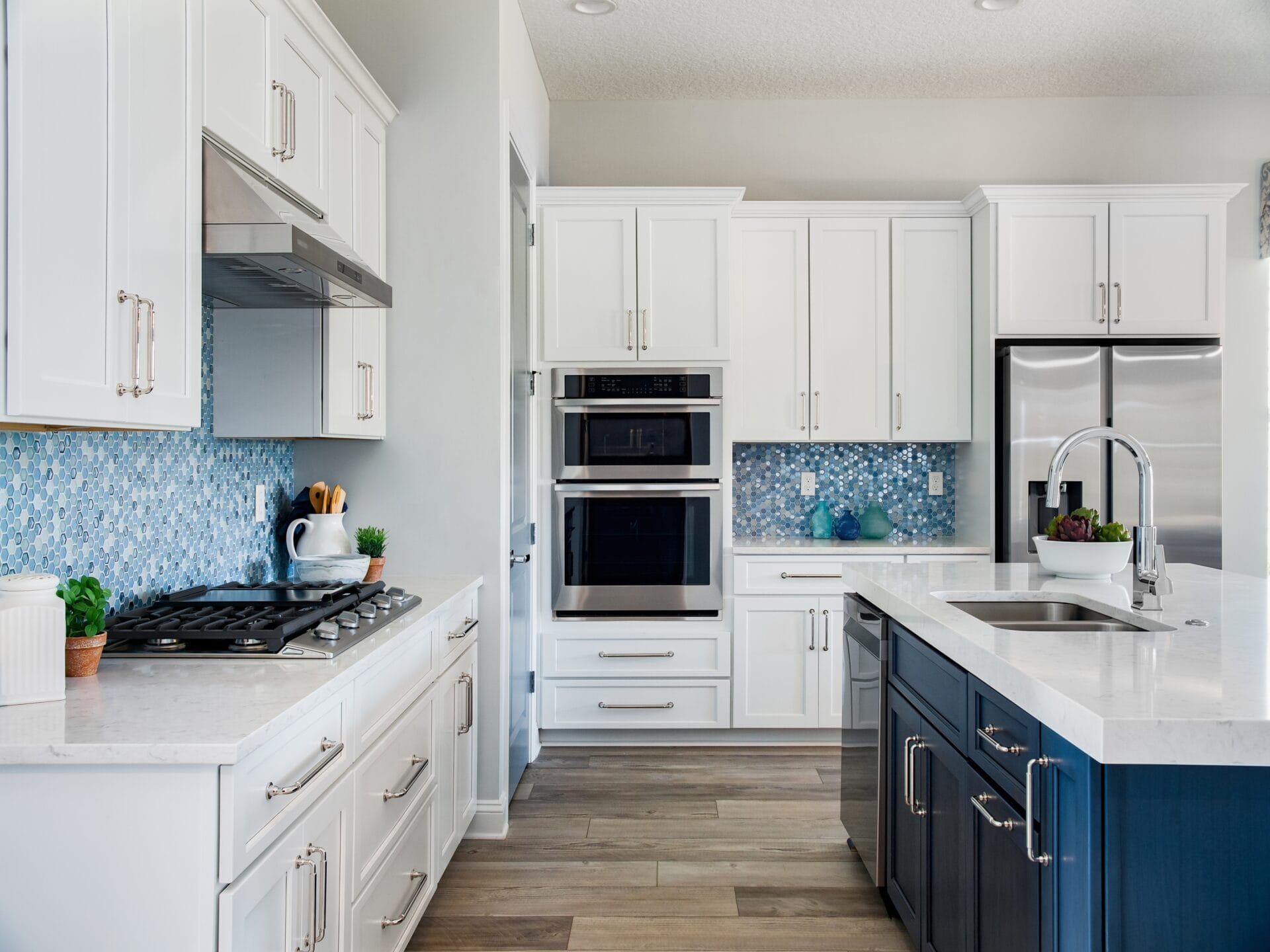
Your kitchen isn’t just made up of walls – there are other colors that are going to also exist in the space, like cabinets, floors, backsplashes, and countertops. If you want a cohesive look, you should let these elements factor into your paint choices.
For example, if you have deep blue cabinets, for instance, a warm complementary shade could be the way to go. Or a crisp, fresh white for the walls, which creates a bright, clean contrast against the deep blue cabinetry. On the other hand, if your kitchen leans more neutral, you have greater flexibility to play with accent colors or vibrant wall shades to make a statement.
What Kind of Mood Do You Want to Create?
Color has a psychological effect on how we feel and interact with a space. Think about the kind of mood you’d like to create in your kitchen.
- Calm and Relaxed: Soft blues, greens, and grays can promote a peaceful and inviting ambiance.
- Warm and Cozy: Earthy tones like terracotta, beige, or warm whites can create a sense of warmth and coziness.
- Bold and Exciting: For kitchens with a wow factor, opt for dramatic hues like charcoal black, deep navy, or vibrant reds.
- Energetic and Uplifting: Bright yellows and soft oranges can energize the space and create uplifting energy.
Picture this: bright turquoise cabinets and cool blue walls that lift your spirits, brightening up even the gloomiest of days or calm browns that wrap you in comfort.
Stay True to Your Style (But Consider Longevity)
How often do you see yourself repainting? If you’re someone who likes to follow trends, choosing a vibrant or ultra-trendy color might limit flexibility in the future. Instead, reserve these bold, fun shades for smaller, easily changeable elements like decor, kitchen rugs, lighting, or tile backsplash.
Classic tones, such as soft whites, beiges, or grays, tend to have more staying power and age better over time. Keep the walls timeless and experiment with trendy colors in accents—this way, you can keep your kitchen feeling fresh with minimal effort.
Use the 60-30-10 Rule
You may know what type of colors you want to go for but are unsure of how much of each to incorporate. How do you balance the colors? A common rule is the 60-30-10 rule – a design principle that helps balance colors in a room to create harmony and visual interest.
- 60% of the room: Dominated by one main color—this could be your wall paint, floor, or ceiling.
- 30% of the room: A complementary color—like your cabinetry, backsplash, or countertops.
- 10% of the room: An accent color to add contrast and personality. Use this in small details like lighting fixtures, rugs, or bar accessories.
For example:
- 60% Dominant Color: Neutral (Soft Beige or Warm Taupe)
Walls or flooring - 30% Secondary Color: Vintage Wine (Deep Burgundy or Merlot)
Accent walls, lower cabinets, or kitchen islands. - 10% Accent Color: Warm White or Cream
Trim, backsplashes, and lighting fixtures.
Pro Tip!
Consider Undertones: Ensure that the colors you choose all have similar undertones (warm, cool, or neutral).
Kitchen Color Palette Options
Now that we’ve covered some of the most important factors to consider when choosing a kitchen paint color — like personal style, lighting, and room size — let’s dive into some palette options to inspire you.
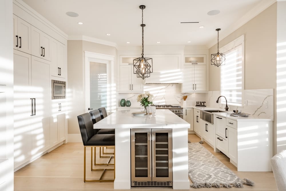
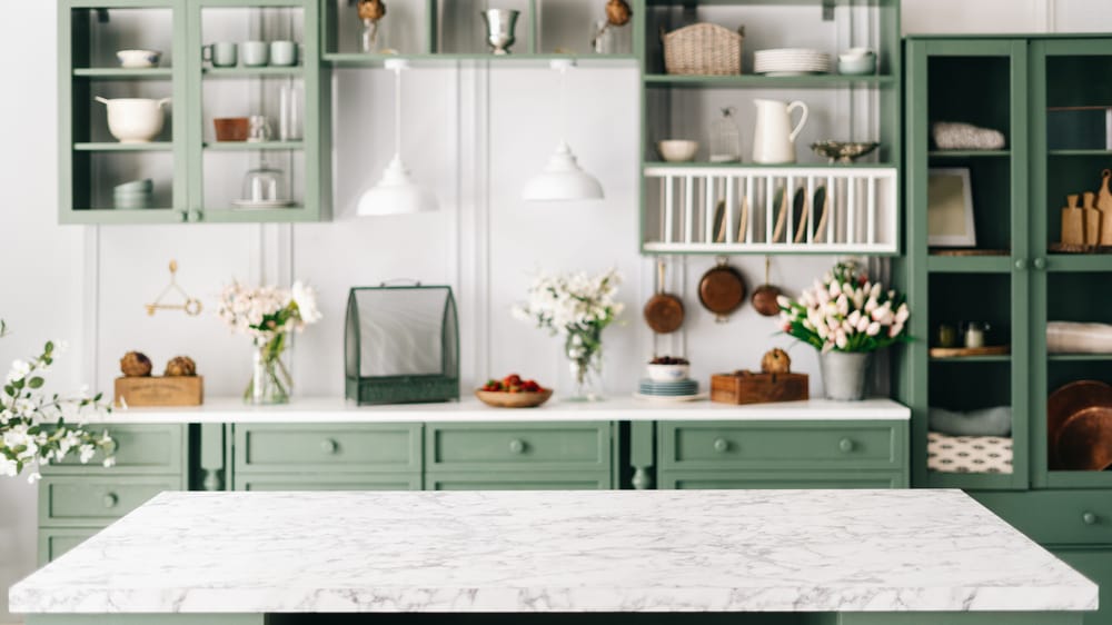
White and Monochrome Kitchens
White and monochrome kitchens never go out of style. The simplicity and clean lines of an all-white or primarily neutral kitchen create a calm, open, and airy space that can make the room feel bigger than it actually does. The beauty of this color scheme is that it allows other elements in the kitchen, such as backsplash tiles, cabinetry, countertops, or flooring, to really stand out and shine.
- All-White with Warm Undertones
White kitchens are a classic for a reason—they’re open, airy, and timeless. But too much white can sometimes feel a bit sterile, right? To avoid that, go for whites with subtle hints of yellow or beige. These warm undertones create a welcoming and cozy vibe without losing that crisp, clean look. Plus, they pair beautifully with accents like light wood or brass hardware, letting other elements of your kitchen really stand out. - Soft Gray and White
Not ready to commit to an all-white kitchen? Adding gray to the mix brings just enough contrast to keep things interesting. It’s sophisticated but not overwhelming and works beautifully whether you lean toward warm or cool tones with your decor. Think light gray cabinets paired with white marble countertops—classic and stunning.
Keep it Neutral
If bright colors or all-white kitchens aren’t quite your style and you’re seeking something more timeless, shades of brown, gray, and cream offer the perfect balance.
- Light Brown, Warm Gray, and Soft Cream
If you love neutral tones but don’t want too much white, consider light browns and greys. Light brown adds that cozy warmth, warm gray keeps things grounded, and soft cream brightens up the space. It’s like they were made to work together! This is perfect for anyone who wants a timeless kitchen that feels warm, cozy, and inviting while still being crisp.
Inspired by Nature
After whites and neutrals, nature-inspired hues like blues and greens are extremely popular—and for a good reason. They bring a sense of calm and serenity to the space without being overpowering.
- Seafoam Green, Sand, and Driftwood Brown
Dreaming of something coastal? This palette instantly transports you to a breezy seaside escape. The soft, seafoam green evokes ocean waves, while sand and driftwood brown add earthy, natural warmth. It’s perfect if you’re going for a refreshing, beachy vibe. - Sage Green, Misty Blue, and White
For something a little softer and more relaxed, try this combination. Sage green gives a natural, earthy touch, while misty blue feels cool and calming. Add white stone for a clean, fresh balance. It’s a great option for kitchens with wooden accents.
Go for a Darker Palette
Not all kitchens need to be light and bright – If that’s not your style, don’t worry. If you have a more masculine taste, go for a darker palette. Dark colors can create a sense of luxury and elegance, especially in larger or open-plan spaces. Keep in mind that they might overpower small spaces.
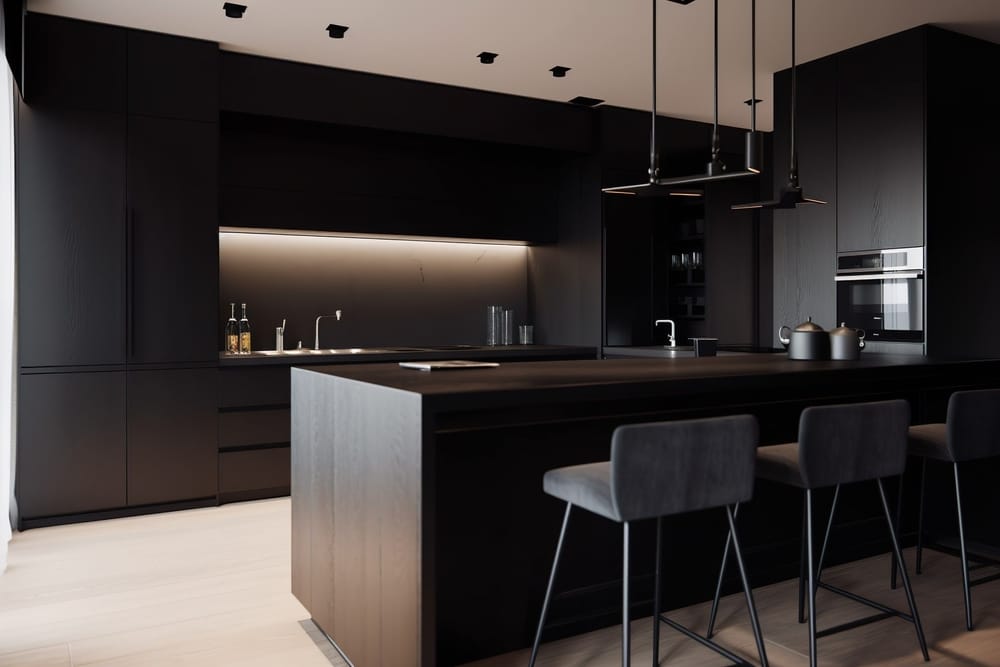
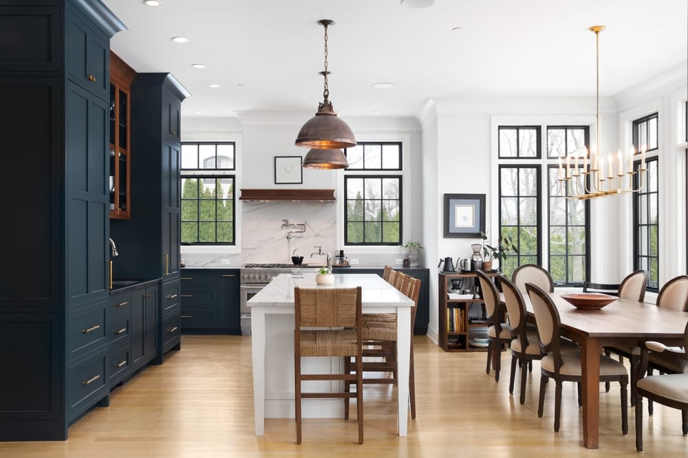
- Navy Blue, Charcoal Gray, and Matte Black
Navy blue, charcoal gray and matte black create a bold, dramatic kitchen that exudes sophistication and modern luxury. The deep navy blue provides richness, while charcoal gray adds depth and complexity. Matte black adds a sleek, contemporary edge that contrasts beautifully with the softer tones. Metallic accents like gold or brushed nickel hardware can add a hint of brightness. - Slate Blue, Coal Black, and Steel Gray
For an industrial-modern feel, this palette is a standout. Slate blue offers depth and richness without being overpowering, while coal black and steel gray give the space strength and elegance. If you’ve always admired contemporary kitchens, this could be your perfect fit.
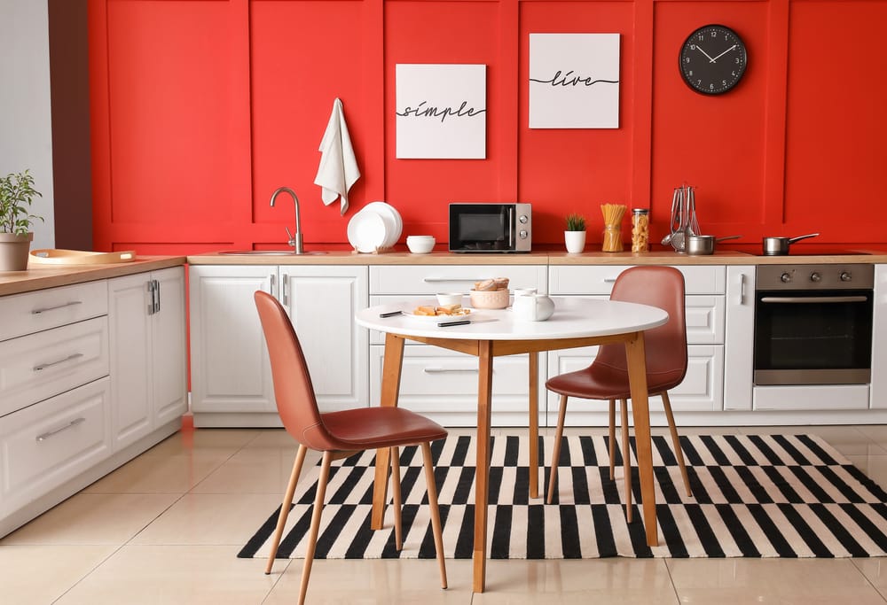
Neutral but with a Pop of Color
Your kitchen doesn’t have to be painted either in all neutrals or just one bright color. You can experiment with color by incorporating an accent wall or a vibrant backsplash. This way, you get the impact of bold colors without committing to painting the entire space in something you might later reconsider.
- Soft Gray, White, and Bright Yellow
Soft gray, white, and bright yellow can create a light, cheerful, and energetic kitchen. Soft gray provides a neutral backdrop that allows the brightness of yellow to stand out without overwhelming the space. The result is a warm, inviting environment that feels uplifting and full of energy yet still grounded in a sense of calm. - Soft Beige, Ivory, and Bold Red
If you’re into warmer tones and bright bursts of color, consider this palette. Beige and ivory create a soothing foundation, while bold red adds excitement and character. You could use the red in a feature wall, a statement kitchen island, or even as an accent on your cabinets. It’s vibrant, dynamic, and perfect for a traditional or rustic-style kitchen.
Ready to Find Your Perfect Kitchen Color? Get Expert Help Today!
Choosing the right color for your kitchen walls is more than just a quick design decision—it requires a lot of thought! It is about creating a space that reflects your personal style, fits seamlessly with the flow of your home, and sets the perfect mood for one of the most important rooms in your house. Whether you’re drawn to classic neutrals, nature-inspired palettes, or darker, more dramatic hues, the perfect kitchen color is out there waiting for you.
Fortunately, with Legacy Painting, transforming your home — including kitchen painting projects — is effortless and stress-free. Partnering with Sherwin-Williams, we offer a free color consultation for homeowners ready to refresh their kitchen space but needing some expert guidance. Reach out today to get started.