
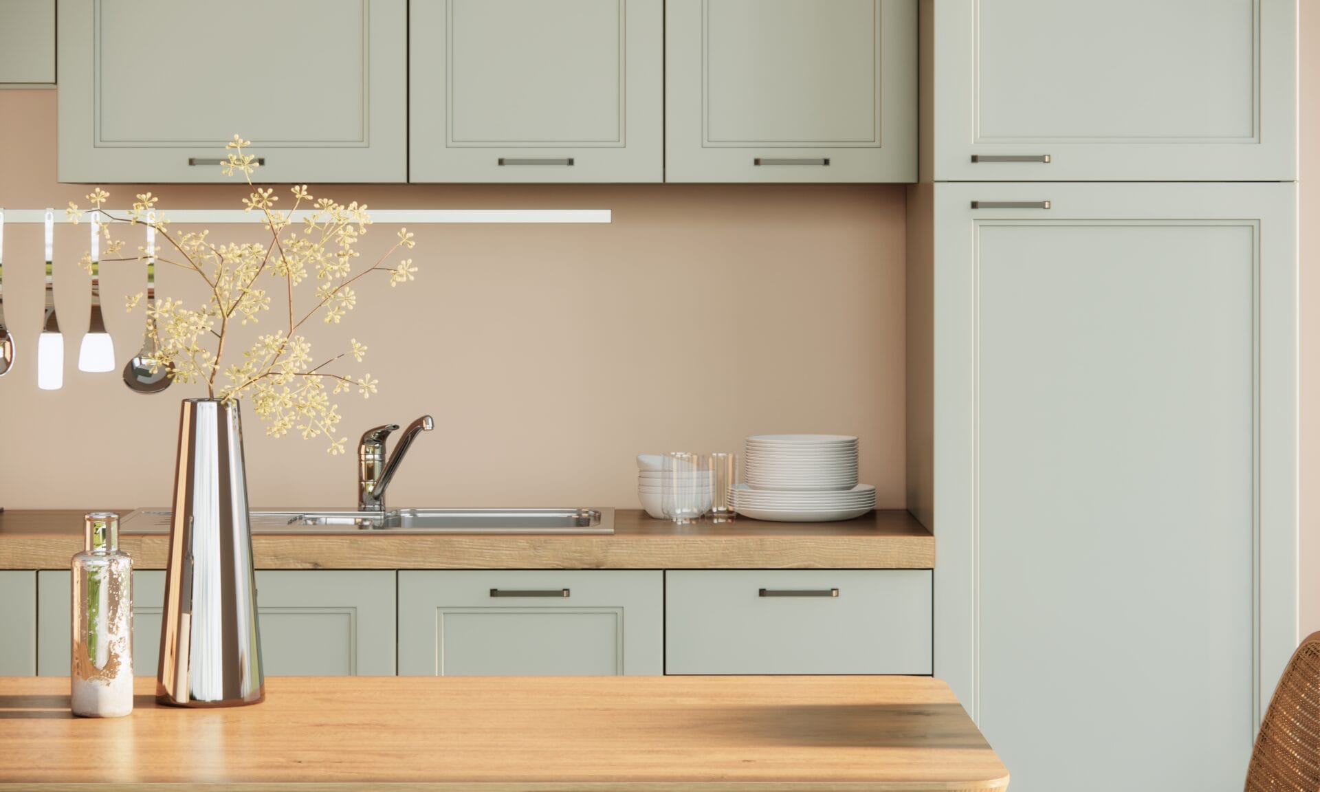
TL;DR: Which Interior Paint Colors Work Best in a Pacific Northwest Winter?
The interior paint colors that work best in a Pacific Northwest winter are warm-leaning neutrals with a fairly high light reflectance value (LRV). Gray, overcast daylight pulls warmth out of a room, so a color that looked inviting in the store can read flat or cold on your walls by November. If you are planning interior painting this fall or winter, our team serves homeowners across King and Snohomish County.
- Lean warm: undertones with a yellow, red, or beige base hold up better in gray light than cool, blue-leaning colors.
- Check the LRV: as a rule of thumb, aim for about 55 or higher in rooms with limited daylight, and about 60 or higher in north-facing rooms.
- Test on the wall: paint large samples and look at them at several times of day before you commit.
How Does Pacific Northwest Winter Light Change Paint Color?
The overcast sky that defines fall and winter in King and Snohomish County acts as a diffuser. Warm, directional sunlight gets replaced by flat, cool, ambient light that enters your rooms from every angle at once. The effect on wall color is predictable: undertones you never noticed on a paint chip become the dominant impression on the wall.
Colors with blue, green, or gray undertones intensify under this diffused light. A soft greige that looked neutral in the store can register as a cold gray by November. Warm undertones (a red, yellow, or orange base) counteract this shift and keep rooms feeling more inviting through the gray months, which is why they come up in almost every recommendation below.
What Is LRV and Why Does It Matter Here?
LRV stands for light reflectance value. It’s a number from 0 (pure black, absorbs all light) to 100 (pure white, reflects all light) that tells you how much light a color bounces back into a room.
In a sunny climate, LRV is a secondary consideration. In a Pacific Northwest winter interior, it becomes a primary one. A room that gets strong direct sunlight can absorb a lower-LRV color without feeling dark. A room lit by gray December daylight cannot.
The LRV Threshold for PNW Interiors
As a rule of thumb, colors with an LRV of about 55 or higher keep rooms with limited daylight brighter through the gray months. Lower-LRV colors absorb more of the light you have, so they suit accent walls or rooms with strong artificial lighting better than main living spaces.
Two examples, with the LRV each manufacturer publishes:
| Color | Code | LRV | Works Well For |
|---|---|---|---|
| Sherwin-Williams Accessible Beige | SW 7036 | 58 | Living rooms, hallways, open floor plans |
| Benjamin Moore White Dove | OC-17 | 83 | Ceilings, trim, low-light rooms needing brightness |
For any color you are considering, the LRV is listed on the manufacturer’s color page.
Warm vs. Cool Undertones: Which Works in PNW Winter?
Warm undertones hold up under diffused, cool light. Cool undertones can amplify the gray cast that’s already present in a PNW winter room.
That doesn’t mean every wall needs to be beige. Complex neutrals with a warm base (greiges, soft taupes, and warm whites) work well because they read as neutral in bright conditions and stay inviting when the light drops. Fully saturated cool colors (deep blues, blue-greens, cool grays) are harder to manage in rooms without strong artificial light to compensate.
Colors Worth Considering
We work with both Sherwin-Williams and Benjamin Moore, so you can choose from either brand’s colors. Four warm-leaning options:
 Sherwin-Williams Accessible Beige SW 7036, a warm greige with a yellow-red base; LRV 58
- Sherwin-Williams Antique White SW 6119, a soft warm white with a cream undertone; LRV 72
- Benjamin Moore Pale Oak OC-20, a warm beige with pink-gray complexity that reads differently as light shifts; LRV 69
- Benjamin Moore Revere Pewter HC-172, a warm gray with a green-brown undertone; LRV 55, so it suits rooms with good daylight or strong artificial light
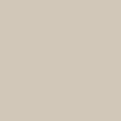 Sherwin-Williams Accessible Beige SW 7036, a warm greige with a yellow-red base; LRV 58
 Sherwin-Williams Antique White SW 6119, a soft warm white with a cream undertone; LRV 72
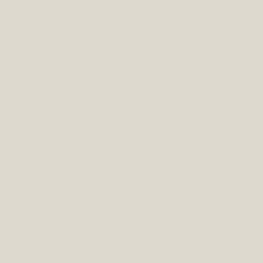 Benjamin Moore Pale Oak OC-20, a warm beige with pink-gray complexity that reads differently as light shifts; LRV 69
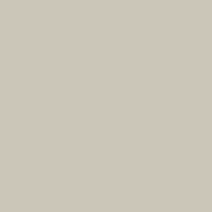 Benjamin Moore Revere Pewter HC-172, a warm gray with a green-brown undertone; LRV 55, so it suits rooms with good daylight or strong artificial light
A note on cool colors: undertone and LRV work together. A cool color with a high LRV can still work in a PNW interior, because its reflectivity offsets some of the undertone shift. The problem arises when a color has both a cool undertone and a low LRV, which is where rooms feel cold.
Which Colors Work in North-Facing and Low-Light Rooms?
North-facing rooms get little or no direct sun in winter, so they depend on cool, indirect light from the sky. In a PNW winter, that can leave them dim for most of the day. The rules for these spaces are stricter.
What to Prioritize
- LRV of about 60 or higher
- Warm undertones; avoid cool and saturated colors unless artificial lighting is strong
- Eggshell or satin sheen (more on this below)
Colors That Hold Up in North-Facing Rooms
- Sherwin-Williams Creamy SW 7012, a warm off-white with a yellow base; LRV 81, so it reads soft and bright in low light
- Sherwin-Williams Navajo White SW 6126, a classic warm white that stays readable without feeling stark; LRV 72
- Benjamin Moore Chantilly Lace OC-65, a clean white with an LRV of 90; works in north-facing rooms that need brightness without a warm cast
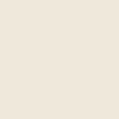 Sherwin-Williams Creamy SW 7012, a warm off-white with a yellow base; LRV 81, so it reads soft and bright in low light
 Sherwin-Williams Navajo White SW 6126, a classic warm white that stays readable without feeling stark; LRV 72
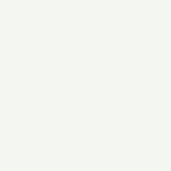 Benjamin Moore Chantilly Lace OC-65, a clean white with an LRV of 90; works in north-facing rooms that need brightness without a warm cast
Rooms Below Tree Canopy
Many homes in Bothell, Woodinville, Kirkland, and the broader Eastside sit among mature evergreens. The green reflected light from surrounding trees enters through windows and can add a subtle cool-green cast to the walls facing them. Warm neutrals counteract this more reliably than pure whites, which can pick up the green tint.
Working With Wood Trim, Floors, and Evergreen Views
Most PNW homes share three fixed elements that affect how wall color reads: wood trim (often painted white or off-white), wood floors in a range of tones, and windows that frame evergreen trees. Each one interacts with your wall color in a specific way.
Floor Tone Pairings
Golden oak floors pull yellow into the room. Wall colors with orange-red undertones can clash; warm greiges and soft whites tend to coordinate better.
Dark walnut floors absorb light and work well with higher-LRV walls that compensate for the absorbed light.
White trim gives the wall color a clean edge to read against, which helps a warm neutral look deliberate rather than dingy in low light.
A Starting Point for Pairings
| Floor Tone | Trim | Suggested Wall Color |
|---|---|---|
| Golden oak | White (e.g., BM Chantilly Lace OC-65) | SW Accessible Beige SW 7036 |
| Dark walnut | White (e.g., SW Alabaster SW 7008) | BM Pale Oak OC-20 |
| Gray-washed oak | White (e.g., BM White Dove OC-17) | SW Antique White SW 6119 |
These are starting points, not prescriptions. The sample-testing process below is where you confirm whether a pairing works in your specific room.
Ready to move from color selection to a finished room? Our team serves homeowners across King and Snohomish County, and you can get a free interior painting estimate online.
How to Test Paint Samples the Right Way
Paint chips are usually picked under bright, even store lighting, and digital swatches depend on your screen. Your home’s winter light behaves differently from both. The only reliable way to choose a color is to test it on your own walls.
The 5-Step Sample Testing Process
- Buy sample pots in the brand you plan to paint with, from a Sherwin-Williams store or a Benjamin Moore retailer, so the sample matches the final product.
- Paint large swatches directly on the wall, about 12 by 12 inches or bigger. A small chip cannot show how a color reads across a full wall.
- Observe the swatch at multiple times of day: morning, midday, late afternoon, and evening under artificial light. In PNW winter, midday is often the brightest the room will get, and it’s still diffused and cool.
- Check the north wall and the south wall of the same room. They will look different from each other, and that difference tells you how the color responds to directional shifts in light.
- Let the swatch dry fully before judging, following the drying time on the label. Wet paint reads darker than dried paint.
Also check the swatch next to your trim color and flooring. A color that looks right in isolation can shift when it sits next to white trim or a warm wood floor.
Sheen Selection in Low-Light Rooms
Sheen affects how light bounces off a wall. In rooms with limited natural light, that bounce matters.
| Finish | Light Reflectivity | Best Use in PNW Interiors |
|---|---|---|
| Flat / Matte | Absorbs light | Rooms with adequate natural light; hides surface imperfections |
| Eggshell | Low reflectivity | Living rooms, bedrooms, hallways with limited winter light |
| Satin | Moderate reflectivity | North-facing rooms; spaces where light return matters most |
| Semi-gloss / Gloss | High reflectivity | Trim, doors, and architectural accents |
For most PNW living rooms, bedrooms, and hallways with limited winter light, eggshell or satin is the practical choice. The same color in flat and in satin will also look slightly different on the wall, because the satin version reflects more light, so test samples in the sheen you plan to use.
FAQ: Interior Paint Colors for Pacific Northwest Homes
What paint colors work best in low-light rooms?
Colors with an LRV of about 55 or higher and warm undertones (a red, yellow, or orange base) perform most consistently in low-light rooms. Sherwin-Williams Accessible Beige SW 7036 (LRV 58) and Benjamin Moore White Dove OC-17 (LRV 83) are two examples. The specific color matters less than the combination of LRV and undertone.
How does overcast light affect interior paint color?
Overcast light is cool, diffused, and flat. It strips warmth from colors with blue, green, or gray undertones, making them read colder and grayer than they appear on a chip under store lighting. Colors with warm undertones counteract this shift more reliably than cool neutrals.
What is LRV and why does it matter for paint?
LRV (light reflectance value) measures how much light a color reflects back into a room, on a scale of 0 to 100. In sunny climates, LRV matters less because daylight is plentiful. In a PNW winter interior, a low LRV can make a room feel noticeably darker. For rooms with limited natural light, an LRV of about 55 or higher is a practical rule of thumb.
How do I test paint colors before committing?
Buy sample pots in the brand you plan to use, paint large swatches (about 12 by 12 inches or bigger) directly on the wall, and look at them at several times of day. Let the swatch dry fully before judging. Check it on different walls in the same room and next to your trim and flooring. Small chips and digital swatches are unreliable in PNW winter light.
What sheen should I use in a dark room?
Eggshell or satin. Both finishes reflect a small amount of light back into the room, which helps in north-facing or low-light spaces. Flat and matte finishes absorb light and can make a dark room feel smaller. Semi-gloss and gloss are typically reserved for trim and doors.
Ready to Paint? We Serve King and Snohomish County
Once you’ve landed on a color, the next step is getting the walls done. We serve homeowners across King and Snohomish County, including Seattle, Lynnwood, Bothell, Kirkland, Woodinville, Bellevue, Everett, and the Eastside.
We’re licensed and insured, so your home is protected while we work. We also work with both Sherwin-Williams and Benjamin Moore, so you are not limited to one brand’s colors. For pre-1978 homes, which may have lead paint under newer layers, we follow Lead-Safe Certified practices.
We hold a 4.9-star average across 500+ Google reviews, and every project is backed by a 3-year warranty covering both labor and materials.
If you’re also thinking about your home’s exterior when the season turns, our post on the best exterior paint colors for Pacific Northwest weather covers the outdoor side of the decision.