Your living room is the heart of your home, a central hub for relaxation, entertainment, and making memories. While furniture and wall color often get the most attention, the cabinets in your living room-whether they are built-in bookshelves, an entertainment center, or storage units-play a massive role in defining the space’s character. Choosing the right paint color for these cabinets can be a game-changer, transforming the entire feel of the room. But with an endless sea of swatches, how do you find the perfect hue?
This guide is designed to help you navigate the world of living room cabinet colors. We will explore everything from timeless neutrals that create a serene backdrop to bold, dramatic shades that make a statement. Get ready to discover ideas that will help you craft the perfect design and feel for your living space, turning functional storage into a stunning focal point.
The Enduring Appeal of Neutral Tones
When it comes to interior design, neutrals are the undisputed champions of versatility and longevity. Choosing a neutral color for your living room cabinets is a safe yet sophisticated bet. These shades create a calming foundation, allowing your furniture, artwork, and decor to take center stage. Far from being boring, the right neutral can feel intentional, elegant, and incredibly chic, providing a backdrop that will stand the test of time.
Timeless Whites and Off-Whites
Have you ever walked into a room and instantly felt a sense of openness and light? That is the power of white. A classic white or a soft off-white is a brilliant choice for living room cabinets, especially in spaces that may lack abundant natural light, a common challenge in many Seattle and Bellevue homes. These colors reflect light, making the room feel larger, brighter, and more airy.
White cabinets provide a clean slate that works with nearly any design style, from modern minimalist to rustic farmhouse. A crisp, pure white offers a sharp, clean look, while warmer off-whites like Sherwin-Williams Alabaster (SW 7008) introduce a subtle softness that prevents the space from feeling sterile. Paired with either dark or light hardware, white cabinets are the ultimate chameleon, adapting to your style as it evolves over the years.
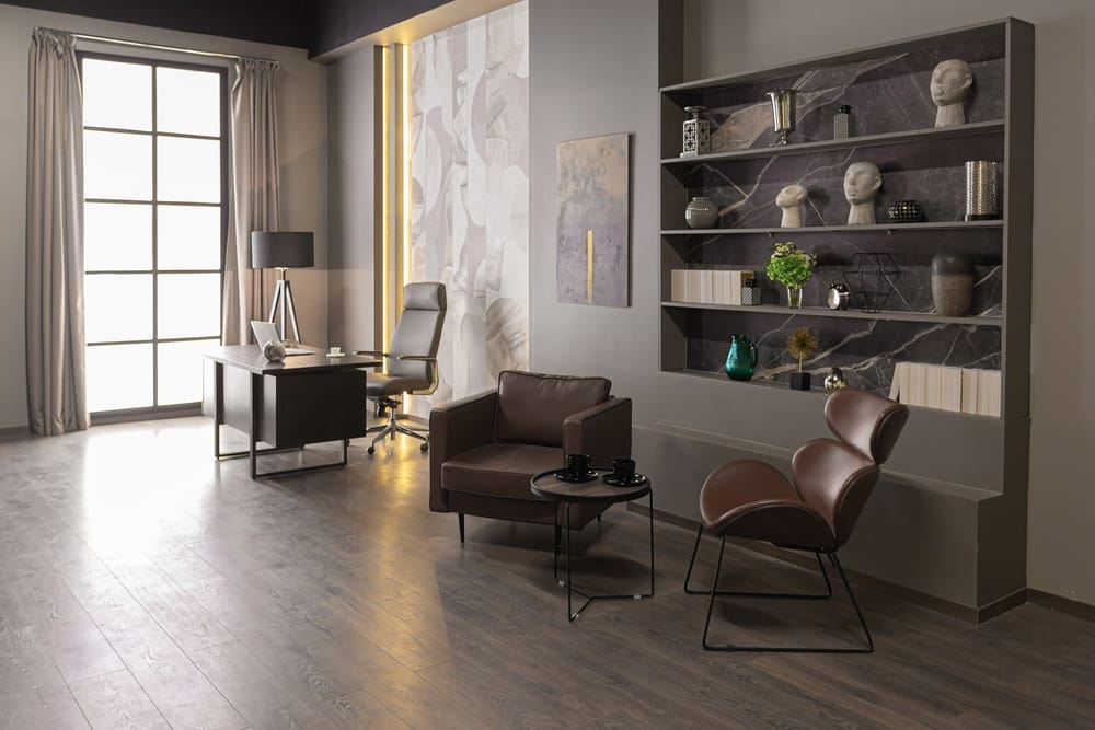
Sophisticated Grays and Grounding Greiges
Gray has become a cornerstone of modern interior design, offering more depth and complexity than a standard white. The beauty of gray lies in its vast spectrum of tones. Cool grays with blue undertones can create a crisp, contemporary feel, while warm grays lean into a cozier, more inviting atmosphere.
Shades like “greige” a perfect fusion of gray and beige, offer the best of both worlds, providing warmth without the yellow undertones of traditional beige. A medium-to-dark gray, such as Sherwin-Williams Peppercorn (SW 7674), can ground your living room cabinets, giving them a sense of substance and permanence. For a softer touch, a light dove gray creates a serene and elegant backdrop that is both modern and timeless. Gray cabinets are exceptionally versatile, pairing beautifully with wood tones, metallic finishes, and a wide range of accent colors.
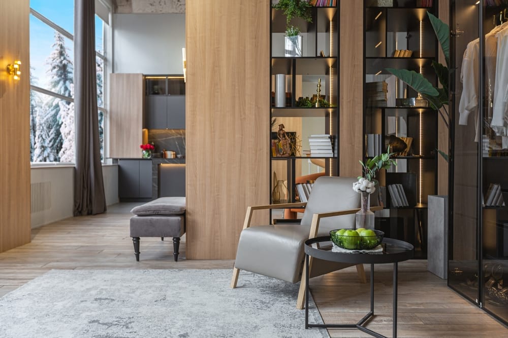
Warm Beiges and Earthy Taupes
To create a living room that feels like a warm embrace, consider earthy beiges and rich taupes for your cabinets. These colors are inherently comforting and create a cozy, welcoming environment perfect for relaxing with family and friends. Unlike the cooler neutrals, beiges and taupes have warm undertones that can make a large, open-concept space feel more intimate and connected.
These earthy hues are fantastic for designs that incorporate natural materials like wood, stone, linen, and leather. A warm taupe on your built-in bookshelves can make the entire wall feel like a custom piece of furniture, adding architectural interest and a touch of organic elegance. These colors are perfect for creating a tranquil retreat from the hustle and bustle of daily life.
Making a Statement: Embracing Bold and Moody Hues
While neutrals offer safety and versatility, sometimes a living room calls for a dose of drama and personality. Bold and moody colors can transform your cabinets from simple storage units into captivating design features. These deeper, more saturated tones can add a sense of luxury, create an intimate atmosphere, or provide a powerful focal point that defines the entire room. If you are ready to be daring, these color families offer incredible rewards.
The Allure of Deep Blues and Greens
There is something undeniably luxurious about deep jewel tones. Rich navy blues, emerald greens, and dark forest greens bring a level of sophistication and depth that is hard to achieve with lighter colors. In a spacious living room, painting the built-ins a deep navy can anchor the room and create a stunning contrast with lighter walls and furnishings. The effect is both grounding and grand.
In a smaller space or a cozy nook, these colors can create a “jewel-box” effect, making the area feel special and intentionally designed. Imagine a reading corner with floor-to-ceiling bookshelves painted in a deep forest green. It becomes an instant retreat. These nature-inspired colors connect the indoors with the lush landscapes of the Pacific Northwest, bringing a sense of organic calm even in their deepest forms. They pair exceptionally well with warm metallic hardware, like brass or bronze, for a truly opulent finish.
Modern Drama with Black and Charcoal
For a look that is unequivocally modern and chic, you cannot go wrong with black or charcoal. Painting your living room cabinets black is a bold move that pays off with incredible visual impact. A black entertainment center or built-in unit creates a sleek, seamless look, especially when paired with modern technology and minimalist decor. It is a fantastic way to hide a large television, allowing it to blend into the cabinetry when not in use.
Charcoal gray, like Sherwin-Williams Iron Ore (SW 7069), offers a slightly softer but equally dramatic alternative. These dark, moody shades create a powerful contrast against light-colored walls, making the cabinetry a deliberate and striking architectural feature. This high-contrast look is perfect for contemporary or industrial-style homes and provides a sophisticated backdrop that makes artwork and decorative objects pop.
Creative Designs with a Two-Tone Approach
Why settle for one color when you can have two? A two-tone design is a fantastic way to add custom character and visual interest to your living room cabinets. This approach allows you to incorporate a bold color without overwhelming the space.
There are several ways to execute a two-tone look:
- Contrasting Backs: Paint the exterior of the cabinets a neutral shade, like white or light gray, and then paint the interior back panel a bold, contrasting color. This adds a surprising pop of color that draws the eye and highlights the items on your shelves.
- Upper vs. Lower: If you have a combination of upper and lower cabinets, consider painting them in different colors. A popular choice is to use a darker, grounding color on the lower cabinets and a lighter, airier color on the uppers. This can make the room feel taller while still incorporating a rich hue.
- Island or Feature Unit: If your living room has a standalone cabinet unit or a prominent central built-in, consider painting it a different color from the rest. A navy blue or deep green feature unit in an otherwise neutral room can act as a beautiful focal point.
This design strategy adds a layer of depth and personality, making your living room feel truly unique and professionally designed.
Finalizing Your Vision: Practical Design Considerations
Choosing a color is just the beginning. To ensure your newly painted cabinets look perfect, you need to consider how they will interact with the rest of your living room. The right color can be enhanced or diminished by factors like lighting, hardware, and existing decor. Thinking through these details will help you create a cohesive and polished final look. Choosing a color is just the beginning. To ensure your newly painted cabinets look perfect, you need to consider how they will interact with the rest of your living room. The right color can be enhanced or diminished by factors like lighting, hardware, and existing decor. Thinking through these details will help you create a cohesive and polished final look. Choosing a color is just the beginning. To ensure your newly painted cabinets look perfect, you need to consider how they will interact with the rest of your living room. The right color can be enhanced or diminished by factors like lighting, hardware, and existing decor. Thinking through these details will help you create a cohesive and polished final look.
Harmony with Existing Elements
Before you fall in love with a paint swatch, take a look around your living room. Your cabinets do not exist in a vacuum. The color you choose should complement your existing:
- Wall Color: Will the cabinet color contrast, complement, or blend with your walls? A bold cabinet color often works best with neutral walls, while neutral cabinets give you the freedom to be more adventurous with your wall paint.
- Flooring: The tone of your wood or carpet will influence how a cabinet color appears. A dark cabinet color might feel too heavy with dark floors, whereas it could look stunning against a light-colored floor.
- Furniture and Textiles: Consider the colors of your sofa, chairs, rugs, and curtains. Your cabinet color should feel like a natural part of the overall color scheme.
A professional cabinet painting project is an investment, so selecting a color that harmonizes with your space is key to long-term satisfaction.
The Impact of Lighting
Lighting is one of the most overlooked but critical factors in choosing a paint color. The same shade can look drastically different depending on the light source. In the Pacific Northwest, where natural light can be soft and gray for parts of the year, this is especially important.
- Natural Light: North-facing rooms receive cool, indirect light, which can make colors appear darker and cooler. Warm neutrals or colors with warm undertones can help balance this. South-facing rooms get bright, warm light, which can intensify colors.
- Artificial Light: The type of lightbulbs you use also matters. LED bulbs come in a range of temperatures (cool to warm), while incandescent bulbs cast a warm, yellowish glow.
Always test paint samples on your cabinets and observe them at different times of day and with your lights on and off. This is the only way to know for sure how a color will look in your unique space.
Selecting the Right Paint Finish
The sheen of your paint affects both its appearance and its durability. For living room cabinets, you want a finish that is tough enough to handle everyday use but also looks great.
- Satin/Eggshell: This is often the most popular choice for cabinets. It has a slight sheen that is elegant and easy to clean without being overly shiny. It hides minor imperfections better than glossier finishes.
- Semi-Gloss: This finish is more durable and easier to scrub, making it a good option for high-traffic areas or families with young children. It has a noticeable shine that will highlight any imperfections in the wood, so flawless prep work is essential.
- Matte: A matte finish offers a modern, sophisticated look with no shine. However, it is the least durable and can be difficult to clean, so it is best reserved for low-use cabinets or decorative built-ins.
Hardware: The Jewelry of Your Cabinets
Think of hardware as the finishing touch that completes the outfit. The style and finish of your knobs and pulls can dramatically alter the overall aesthetic of your cabinets.
- Black Hardware: Creates a modern, high-contrast look, especially on white or light-colored cabinets.
- Brass or Gold Hardware: Adds a touch of warmth and luxury. It pairs beautifully with deep blues, greens, and blacks.
- Nickel or Chrome Hardware: Offers a classic, versatile look that works well with cool-toned paints like gray or blue.
- Bronze Hardware: Provides a rustic, traditional feel that complements warm neutrals and earthy tones.
Conclusion
Choosing the right color for your living room cabinets is a powerful way to redefine your space. Whether you opt for the clean, timeless look of neutrals, the dramatic sophistication of moody hues, or a creative two-tone design, the perfect color will elevate your cabinets from simple storage to a stunning design feature. By considering your room’s lighting, existing decor, and the final hardware touches, you can create a cohesive and beautiful look that reflects your personal style.
A professional paint job ensures that your vision is executed flawlessly, resulting in a durable, factory-like finish that will stand the test of time. A cost-effective alternative to a full replacement, professional cabinet painting can completely revitalize your living room and increase your home’s value.
Ready to Transform Your Living Room?
If you feel inspired to give your living room cabinets a fresh new look but are unsure where to begin, our team at Legacy Painting is here to help. Serving homeowners across King and Snohomish Counties, we provide expert guidance and impeccable craftsmanship. Contact us today for a free, no-obligation estimate and let’s start planning your transformation.